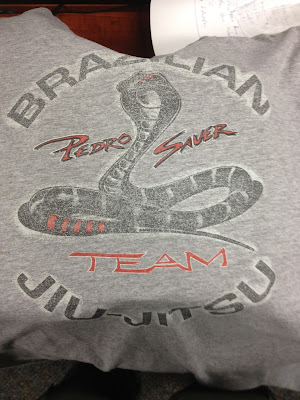
There's nothing wrong with this design, except for the fact that it is now "dated" -- meaning you can tell it was designed some years back. The fonts used and style of cobra almost scream out Karate Kid.
So we took this design and kicked it up a notch. Although the preview below shows the design on a gray t-shirt, it has been made to work on all colors (which is the plan for Mr. Sauer).
Lets break this down... The front now displays the Pedro Sauer Jiu-Jitsu Association logo right in the center of the chest. The stripes you see, on what would be your left side if wearing it, represents the ranking belt thrown over the shoulder. Photo of belt shown below.

The back design now has a more fierce cobra with jaws open and fangs revealed. "Brazilian Jiu-Jitsu" has been placed along the bottom as to not give the appearance of a caged animal. I thought the old image tamed the cobra by placing it inside of the circled text. And finally, the back image was kept in the same color theme as the front so it wouldn't look like two completely different identities.
Luckily, we were able to complete the design with the least amount of colors needed. Since the main object of this design is for screen printing purposes, you always have to remember that more colors means more money.
Of course, more colors might be great for a designer, but we try to keep the customer's finances in mind.
We'll post an update as soon as the shirts are produced and are able to get our hands on one.


No comments:
Post a Comment