I was asked to create a flyer and raffle tickets for an incredible 7-month old child named Alonso.
Baby Alonso was born on September 23, 2011 with two congenital heart defects; coarctation of the aorta and borderline hypoplastic left heart syndrome. These defects were not discovered until 9 days after birth when he started turning blue and was rushed to the emergency room. Doctors where able to stabilize him enough to have him flown to San Antonio [Texas] Methodist Children's Hospital where he underwent open heart surgery to correct the coarctation and create a hole in the atrium to relieve pressure in the left side of his heart. Alonso also underwent a nissen fundoplication to address his severe reflux which almost killed him after his heart surgery. Recently the coarctation has resurged twice but has been corrected with heart catheterizations. If his aorta doesn’t hold, he is going to undergo a second open heart surgery. In a few years, Alonso will require open heart surgery to close the hole in between the atriums.
With the help and generosity of the Spanish Rock group Maná, all members autographed a Squire guitar that is now being raffled for an "Autographed Guitar Giveaway".
Tickets are going for $10.00 a piece; ALL proceeds go to baby Alonso's family to help with medical expenses.
If you have any questions, or would like more information on where to aqcuire tickets or give a monetary donation, please feel free to contact me at Oz@GraphicLaunch.com or you can also call Mr. Molano at 956-337-8942.
Your help and prayers are greatly appreciated.
Saturday, April 14, 2012
Wednesday, March 28, 2012
I paint, but I'm not a painter...
I'll explain the title... Before the days when I even knew what Graphic Design was, there were pencils, crayons, colored pencils, markers, and paint. My parents say they knew my talent since the age of three.
It wasn't until high school that I found out what the digital world had to offer.
The primitive people figured things out on their own, recording time and history with paint made from mud, fruits, and anything else the Earth presented. I can honestly say, I've never taken a real painting class in my life. Most of it I've learned from trial and error, or by observing others. By no means do I consider myself a "painter", but I have (and do) play around with the media on occasion.
Just yesterday evening a friend of mine asked if I could paint something for him... I try not to take specific requests for anything other than digital graphics. The problem being that my "art" comes with inspiration, which nowadays is harder to find time for.
"Niagara Falls," he says.
Wow. Niagara Falls. Let's just draw up one of the seven wonders of the world... no problem...
But, because it's his birthday today, and because I have not painted in a LONG time, I decided, why not. I did give him fair warning though, "you may not get what you're hoping for."
Unfortunately, I did not take photos along the process because (not to sound conceded but - ) I did not expect it to come out as good as it did.
Now, before you scroll down to see the finished product, keep in mind - I DO NOT TAKE REQUESTS FOR PAINTINGS OR DRAWINGS. Sorry.
Enjoy!
"The Great Falls"
At the beginning of this post I mentioned the primitive people for the reason that (again) I don't consider myself a painter. Painters would laugh at the tools I use. For example, I have a set of 6 very cheap brushes that I bought at Michael's for about $4.00. And I have the most inexpensive paints you could possibly buy (because I'm cheap). And I wait until canvases are on sale to buy any. And I use paper plates as my palette (pictured below).

It wasn't until high school that I found out what the digital world had to offer.
The primitive people figured things out on their own, recording time and history with paint made from mud, fruits, and anything else the Earth presented. I can honestly say, I've never taken a real painting class in my life. Most of it I've learned from trial and error, or by observing others. By no means do I consider myself a "painter", but I have (and do) play around with the media on occasion.
Just yesterday evening a friend of mine asked if I could paint something for him... I try not to take specific requests for anything other than digital graphics. The problem being that my "art" comes with inspiration, which nowadays is harder to find time for.
"Niagara Falls," he says.
Wow. Niagara Falls. Let's just draw up one of the seven wonders of the world... no problem...
But, because it's his birthday today, and because I have not painted in a LONG time, I decided, why not. I did give him fair warning though, "you may not get what you're hoping for."
Unfortunately, I did not take photos along the process because (not to sound conceded but - ) I did not expect it to come out as good as it did.
Now, before you scroll down to see the finished product, keep in mind - I DO NOT TAKE REQUESTS FOR PAINTINGS OR DRAWINGS. Sorry.
Enjoy!
"The Great Falls"
After the Falls, the inspiration still lurked within so I continued this morning.
<unnamed>
At the beginning of this post I mentioned the primitive people for the reason that (again) I don't consider myself a painter. Painters would laugh at the tools I use. For example, I have a set of 6 very cheap brushes that I bought at Michael's for about $4.00. And I have the most inexpensive paints you could possibly buy (because I'm cheap). And I wait until canvases are on sale to buy any. And I use paper plates as my palette (pictured below).

I am primitive.
Wednesday, March 21, 2012
Enterprise Elementary
Good evening followers! If you truly are an avid follower, you know I have not posted any recent entries on this blog. For that I apologize. If you are a first-timer, you will know by the posted dates that this is true.
Let's get to it. If you skim around GraphicLaunch.com, you will come across a design (under "Mascots") for Enterprise Elementary. This design was a remake of a very traditional "old school" looking logo/seal. If I can get my hands on it, I will definitely post the comparison.
I was recently asked by my contact, if I would be willing to help once again.
It is very unfortunate when someone you know is diagnosed with anything, let alone cancer. The school's PTA wants to sell t-shirts as a fundraiser for a respected teacher at the school. The funds raised would assist in covering her medical costs.
By following the guidelines and ideas provided, the design below was created. I am not certain what color shirts are planned for the final production, so for viewing purposes, I've left it on a white background.
This design was created in Adobe Illustrator for silkscreening. Three colors were used to limit final cost: white, black, pink.

Saturday, February 4, 2012
Wodever Expansion
Wodever Performance Gear is quickly expanding. With shipments quickly coming in, it is imperative that all business aspects are covered - especially contact information.
Even in the present-day digital world, business cards are one of the most important and cost-effective marketing tools a business can have.
Think for a second: It is extremely simple to share contacts through your smart-phone, but how many contacts are on your list that you have no idea who that person is, or who that phone number belongs to?
A powerful and well-designed business card can effectively promote your business. On the other hand, there's a good chance that if the look and quality of your card is shoddy or unprofessional, it may be thrown into the trash and forgotten.
Below is the new business card design for Wodever Performance Gear...
Tuesday, January 31, 2012
[UPDATE] Wodever
A good friend of mine, as well as an exceptional photographer, coincidentally attended the event in which Wodever made it's first appearance (see previous post).
Zero Photography took some amazing photos at the SPX Crossfit event, including the beautiful women sporting the Wodever name brand. I have "borrowed" some of his photos to include for your viewing pleasure.
I didn't officially ask for his permission, but I don't think he'll mind...
Enjoy!
Zero Photography took some amazing photos at the SPX Crossfit event, including the beautiful women sporting the Wodever name brand. I have "borrowed" some of his photos to include for your viewing pleasure.
I didn't officially ask for his permission, but I don't think he'll mind...
Enjoy!
Saturday, January 28, 2012
Wodever
Below is an exert from a conversation that took place through text messaging...
Jan 9, 2012 9:14 PM
DC: I need your help, ive requested a trademark on the name wodever, a play on the acronym wod and ever and the word whatever... Can you help me create a logo?
Graphic Launch: Definitely.
DC: Sweet, thanks!
Of course, there was more that was said in between such as ideas, color options, symbols, etc...
Jan 10, 2012 7:52 PM
GL: Sir do you have a personal email? I have a few concepts for you...
DC: Gotem open, these look sweet!!! Let me lookem over and ponder. Thanks!!!!
Four concepts, to be exact. I created four different concepts (shown below) with the route provided by the customer. He wanted to incorporate the infinity symbol somehow into the logo. Although he wanted to use the color blue, I advised against it only because of the audience and environment he is trying to represent or aim towards. So we opted for red.
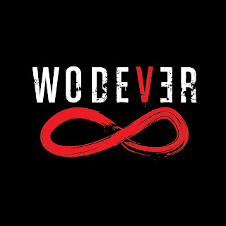
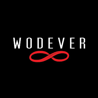
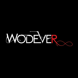
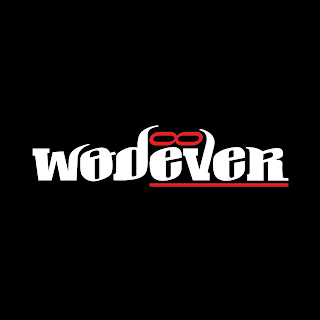
To explain a bit more, the "WOD-" comes from the crossfit term workout of the day. "-EVER" comes from the word forever, meaning never give up, never stop. And also, a play on the word "whatever" since he plans on selling crossfit gear such as t-shirts, caps, socks, wristbands, etc.
Roughly two weeks later, a winner was chosen (thankfully, with no changes or adjustments - just the way we like it).
Concept number 2 (below).

A big thank you goes out to DC for sending us this photo. Good luck!
Look out for these guys and for more photo updates...
Jan 9, 2012 9:14 PM
DC: I need your help, ive requested a trademark on the name wodever, a play on the acronym wod and ever and the word whatever... Can you help me create a logo?
Graphic Launch: Definitely.
DC: Sweet, thanks!
Of course, there was more that was said in between such as ideas, color options, symbols, etc...
Jan 10, 2012 7:52 PM
GL: Sir do you have a personal email? I have a few concepts for you...
DC: Gotem open, these look sweet!!! Let me lookem over and ponder. Thanks!!!!
Four concepts, to be exact. I created four different concepts (shown below) with the route provided by the customer. He wanted to incorporate the infinity symbol somehow into the logo. Although he wanted to use the color blue, I advised against it only because of the audience and environment he is trying to represent or aim towards. So we opted for red.


To explain a bit more, the "WOD-" comes from the crossfit term workout of the day. "-EVER" comes from the word forever, meaning never give up, never stop. And also, a play on the word "whatever" since he plans on selling crossfit gear such as t-shirts, caps, socks, wristbands, etc.
Roughly two weeks later, a winner was chosen (thankfully, with no changes or adjustments - just the way we like it).
Concept number 2 (below).

"Wodever" (in a period of three weeks) has now chosen a logo, made branded t-shirts (shown below), and has started putting their name out at competitions!

A big thank you goes out to DC for sending us this photo. Good luck!
Look out for these guys and for more photo updates...
Friday, January 13, 2012
Reviving the Dead!
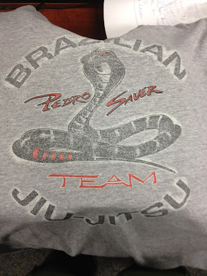
I get a joy out of redesigning old designs. Below is a photo of one of Pedro Sauer's favorite t-shirts. I am not exactly sure how old this shirt is, but as you can tell, it has some time and it's been put to good use.
Lets break this down... The front now displays the Pedro Sauer Jiu-Jitsu Association logo right in the center of the chest. The stripes you see, on what would be your left side if wearing it, represents the ranking belt thrown over the shoulder. Photo of belt shown below.

The back design now has a more fierce cobra with jaws open and fangs revealed. "Brazilian Jiu-Jitsu" has been placed along the bottom as to not give the appearance of a caged animal. I thought the old image tamed the cobra by placing it inside of the circled text. And finally, the back image was kept in the same color theme as the front so it wouldn't look like two completely different identities.
Luckily, we were able to complete the design with the least amount of colors needed. Since the main object of this design is for screen printing purposes, you always have to remember that more colors means more money.
Of course, more colors might be great for a designer, but we try to keep the customer's finances in mind.
We'll post an update as soon as the shirts are produced and are able to get our hands on one.
There's nothing wrong with this design, except for the fact that it is now "dated" -- meaning you can tell it was designed some years back. The fonts used and style of cobra almost scream out Karate Kid.
So we took this design and kicked it up a notch. Although the preview below shows the design on a gray t-shirt, it has been made to work on all colors (which is the plan for Mr. Sauer).
Lets break this down... The front now displays the Pedro Sauer Jiu-Jitsu Association logo right in the center of the chest. The stripes you see, on what would be your left side if wearing it, represents the ranking belt thrown over the shoulder. Photo of belt shown below.

The back design now has a more fierce cobra with jaws open and fangs revealed. "Brazilian Jiu-Jitsu" has been placed along the bottom as to not give the appearance of a caged animal. I thought the old image tamed the cobra by placing it inside of the circled text. And finally, the back image was kept in the same color theme as the front so it wouldn't look like two completely different identities.
Luckily, we were able to complete the design with the least amount of colors needed. Since the main object of this design is for screen printing purposes, you always have to remember that more colors means more money.
Of course, more colors might be great for a designer, but we try to keep the customer's finances in mind.
We'll post an update as soon as the shirts are produced and are able to get our hands on one.
Thursday, January 5, 2012
Why Hire a Professional? -- The Frustrations of a Designer
For you designers out there, you definitely know the frustrations you come across when dealing with certain clientele.
There are many, many people out there that don't understand marketing or logo/brand concepts. In many cases, these individuals are placed in high positions, and power is confused with knowledge.
I was asked to create a logo for a new branch of a bigger whole (which shall remain nameless). The new branch will be called Occupational Safety & Health (OSH).
This individual came to us for a reason... but doesn't understand that reason.
We did not know this until after the concepts were presented.
Since we had no real direction and the client did not offer any ideas, we came up with three completely different ideas. The one below (which was not at all liked) was the most "decent" out of the three.


"How did that happen," you may ask... Simple. We can recommend and suggest to a certain point, but if the individual is not willing to take in the suggestions, your result is ultimately what they want. Again, as a designer these are common frustrations you come across. Sadly, the client is always right and their happiness is key.
But why hire a professional for a job you could have done yourself?
You wouldn't visit a surgeon for a $.10 band-aid, would you?
Tuesday, January 3, 2012
Logo Design - Wolf Records
We recently received a logo design request from a client for Wolf Records. This gentleman is starting his recording studio and would like a logo to brand everything from the beginning.
His ideas were "...one of them to look like the 1950s. And so that the color can be used in black / dark colored tshirts... Include one of those old school microphones."
With a name like Wolf Records, it is not difficult at all for the mind to begin throwing out ideas.
At Graphic Launch, we generally like to provide two to three concepts for comparison and direction. Unless of course, our clients know exactly what they're looking for and are specific in the design they want.
Below are three concepts we created for our client to look at.
• Concept 1 - was created with a silhouette of a wolf in a vinyl record which also dubs as a full moon.


His ideas were "...one of them to look like the 1950s. And so that the color can be used in black / dark colored tshirts... Include one of those old school microphones."
With a name like Wolf Records, it is not difficult at all for the mind to begin throwing out ideas.
At Graphic Launch, we generally like to provide two to three concepts for comparison and direction. Unless of course, our clients know exactly what they're looking for and are specific in the design they want.
Below are three concepts we created for our client to look at.
 |

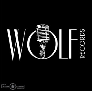
• Concept 2 - was created with the "old school microphone" in mind.

• Concept 3 - was created with a completely different feel to the previous two. It has a simplified outline of a wolf's face.
Our client decided on Concept 2. No further changes were needed to the existing design so that was great! At this point, we usually start playing with color choices and options, but he liked the logo just the way it is, so black and white was perfect!
If only all of our clients were as easy as Wolf Records...
Below is the final logo on both a white background and black background.

Subscribe to:
Posts (Atom)


